Why is a chroma key backdrop green?

Here at EZbackgrounds, we only offer one type of “real world” backdrop. That backdrop is, of course, the chroma key green screen. Actually, what we offer is a couple of shades darker than true chroma key green, but we’ll cover that later in the article.
So, of all the colors in the spectrum, why is this ugly, bright, almost neon green the standard in chroma key photography and video? Why not red, or yellow, or purple or any other color? And what about blue?
Loving the Skin I’m In
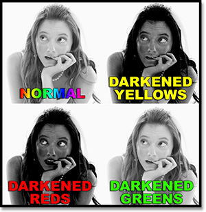
When it comes to skin, we all have one thing in common. We don’t carry very much of the color green. No matter what your background or where you are from; you are likely a mixture of yellows and reds.
To illustrate this, we used the Black and White function in Photoshop (Alt+Shift+Ctrl+B), which doesn’t remove the actual color information of the image as it would if converted to Grayscale. Selected colors were darkened. We darkened selected color to view their presence within human skin. As you can see, the darkened blues and greens are barely distinguishable; whereas the changes in the yellows and reds are quite profound.
The advantage of using the green screen in this regard is that Photoshop or other programs capable of keying in on a particular color will not drag half of a person’s face away like they would with a yellow or red backdrop.
It’s a Sensitive Subject
Today’s digital cameras mimic the human eye in one particular way by being more sensitive to green light. Why our eyes are more sensitive to green is better answered by a biologist. As photographers we can merely be content with the “what” of it all.
This feature of the image sensors is beneficial to a photographer’s purposes on two fronts. One is that less light is needed to record the color green. The other is that there is less noise within the green channel. The less noise within a particular color channel, the easier it is to key in on that color.
What About Blue?
Since blue is also not largely present in skin, it can be used as well. If either green or blue are present on a person’s clothing or within a particular scene, then it would be beneficial to use a backdrop of the color less present. As it stands today, green is a less likely color of clothing. This is something of which you should be aware when shooting with a green screen.
Blue is more often used in video and film than in still photography, but could still hold advantages if that much versatility is needed.
Blue also has less luminance than green which is particularly useful if the subject must be close to the backdrop. The higher luminance of the green makes “spillover” more likely. Spillover is the reflection of the colored background onto the subject; creating a green or blue aura that can make it significantly more difficult to extract a subject from a background and to make the new background and subject blend in a realistic way.
The EZbackgrounds Advantage
It is because of the potential spillover effect that the chroma key green backdrops we offer here at EZbackgrounds are a few shades slightly darker than true “chroma key green”.
If you enjoyed this article, get email free updates
Article Takeaways
1. People's skin contains very little green coloring which makes for greater contrast with the background.
2. Imaging sensors are more sensitive to green which means less noise and less light is needed to illuminate the backdrop.
3. Blue is more common in film and video; but can still be useful in certain situations.
4. EZbackgrounds' green screen backdrop is a few shades darker than true chroma key green which makes for less spillover.


