Halloween Skull Face in Photoshop
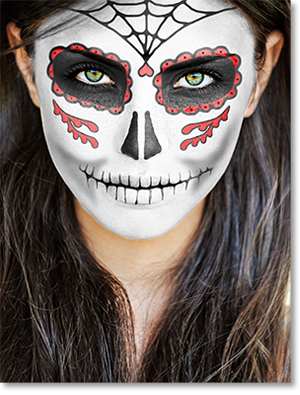
For Halloween this year, my wife wanted us to dress up as skeletons. Not just any skeletons, though. She wanted us to paint our faces like sugar skulls from Day of the Dead.
Dia de los Muertos in Spanish, this colorful Mexican holiday is noted for its face paintings based on human skulls. The illustrator in me found this idea intriguing and I went straight to my trusty Photoshop to sketch out a few designs.
It was a lot harder to get a realistic painted look than I thought it would be. I tried many different blending modes and nothing worked. I tried map displacements; no go. Even my current favorite technique, frequency separation, came up short.
The Solution
Finally, it occurred to me that I had been over thinking it. The best way to do it turned out to be so simple that a beginner using GIMP could achieve the same results using this method.
Basically, what I did was paint all the different face decorations on their own separate layer and stacked them on top of the original subject image.
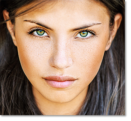
This technique is much easier to apply when the subject’s face is facing straight-on face and the mouth is closed; particularly while you are learning the process. I didn’t want to subject you to my face, so for the purposes of this tutorial, we will be using an image of the lovely Margarita.
The Process
The Process is short, but you will have to repeat it several times because each element gets its own layer. There is a certain amount of pre-planning involved because of the stacking of the layers. You will want to start with the base paint of the entire face, then work your way through the eyes, nose and mouth. Finally, you can add the details; although they may ultimately occupy lower layers beneath the main elements.
Layout the Pattern
First, duplicate the subject layer just in case (Ctrl+J). It’s not necessary, but it never hurts. Next, create a new layer by clicking the New Layer button in the Layers Window. Double click over the text in the layer to rename it “face” or whatever helps you recall the layer later.
For the base coat of her face, I went with the traditional white for the color of bone. At this point, it actually doesn’t matter what color you choose, but I like to keep it consistent for easier workflow.
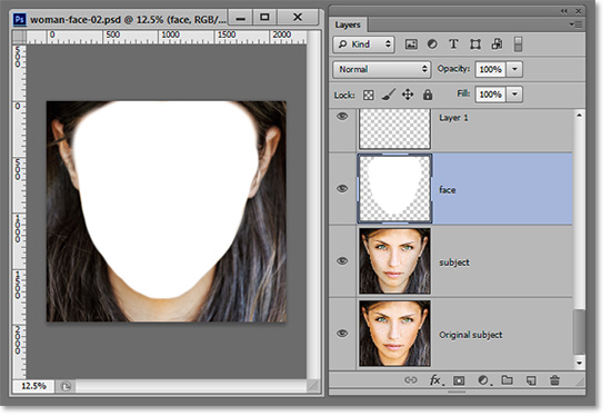
Select a large brush with edges around 60%. You don’t have to be exact at this point because you will be able to come back later. Paint over the area of your subject’s face that would be covered with the base white makeup. When finished, you should have a solid white area in the shape of a head.
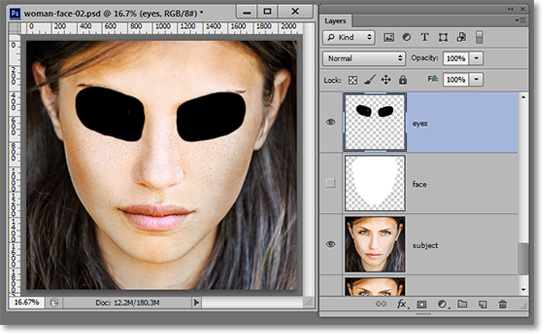
Create a new layer above the white face layer and name this one “Eyes”. You may want to do a different layer for each eye if you want more independent control over edits. It will be easier to draw the eyes properly if you can see the face, so make the previously drawn white layer invisible by clicking on the eye icon next to that layer.
Select a little smaller brush size and change the color to black. Change the brush size on the fly using the bracket keys as described in our EZTips & Tricks. Paint each eye socket. Try to view the ridges of your subject’s eye sockets while drawing for a more realistic effect.
Next, create another new layer and call it “Nose”. Paint in the nose cavity while being aware of the contours of your subject’s own nose. Some draw a solid nasal cavity, but I think it looks too much like an animal nose that way.
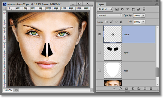
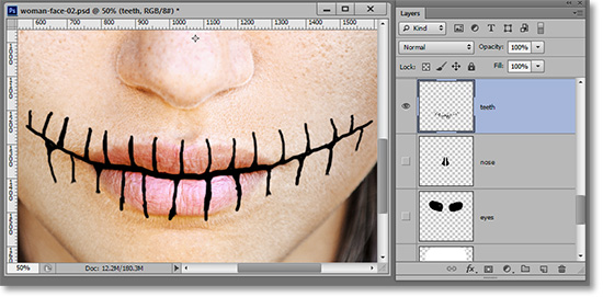
The same procedure applies to the teeth layer. However, they are the most detailed portion so far and it may take some practice to get to where you like it. Obviously, you will need a much smaller brush to draw in the teeth since you are actually drawing the space between the teeth.
Side Tip
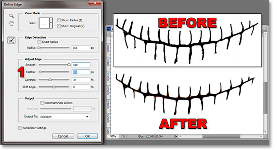
If you have a shaky hand as I do, there is a little trick that will help your drawing look smoother. After you’ve made your drawing, create a selection around the teeth and go to Select>Refine Edge. I usually have to jack the Smooth slider all the way to the right to get my lines looking better (1). Then I usually give the contrast a little bump and set my feather to around “1”. Click OK and you should be good. If not, try the Smooth effect again.
Copy the Face
Make everything invisible except for the subject and the white base layer. Place your cursor over the white base layer image in the Layers Window and left-click with your mouse while pressing the Ctrl key. This will create a selection in the shape of the white painted area.
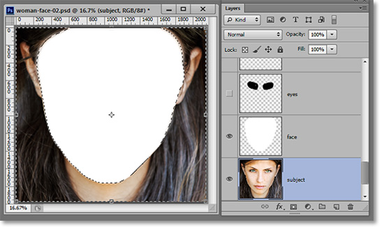
Click on the subject layer to highlight it, press Ctrl+C to copy that area of the subject’s face. Click again on the white layer and press Ctrl+V to paste the copied selection. The pasted portion should be in the same position as it occupied in the original subject.
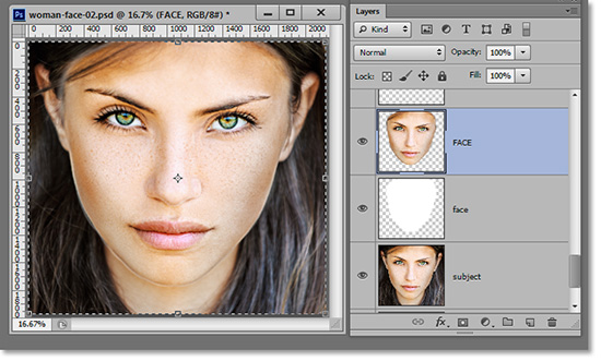
Rename the new layer “FACE” in all caps so you can tell the difference should you decide to keep the white layer. I usually make the old white layer invisible and put it in a separate folder just in case I need it again later. But, if you’re confident, you can just delete it.
Paint the FACE White
Select the FACE layer. Go to Image>Adjustments>Brightness/Contrast. Slide the Brightness slider to the right to brighten the face to a point just before any of the whites begin to get clipped or blown-out. It’s different for each image, but it’s usually a minor adjustment.
Next, go to Image>Adjustments>Desaturate (Shift+Ctrl+U) to desaturate the face.
Our goal with this next step is to lighten as much of the midtones as possible while still maintain whatever shadows are in the face.
The shadows are what will give it texture on the lighter layers. On the other hand, when we do this step to the eyes that are black, we will want to retain the highlights.
With the Dodge Tool selected (O), go to the Range drop-down menu in the Options bar and select Highlights. If you don’t see an Options bar, go to Window>Options to bring it up.
Brush over the FACE layer. You don’t have to be careful with the edges while brushing since the face is the only element on that layer.
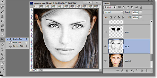
If you got pretty close to the edge of white when you brightened the layer, then the Dodge Tool set on Highlights will likely be overkill. If so, undo it (Ctrl+Z) and change the Range to Midtones.
If the effect is too much, undo it and lessen the Opacity setting and try again until it looks good. Remember, you are trying to keep the shadows visible to create the texture of the face without blowing out the whites. This can take a little practice.
Paint the EYES Black
You will want the eye layer to be above the face layer. So, make the eyes visible again and you can make the FACE layer invisible or not; whichever works for you.
Note that we have cut the eyes out already. If you are following along, we don't get to that until a little later. Your image should still have black and white eyes.
The beginning of the procedure is the same as before. You create a selection of the eyes, create a copy of the subject layer in the shape of said eye selection, and paste above the “eyes” layer. Rename the new layer “EYES” and do to the “eyes” layer what you did to the “face” layer; keep it or toss it.
Desaturate the layer (Shift+Ctrl+U). This time, since you want to make the eyes black instead of white, select the Burn Tool (O) from the same button on the Tools Palette that contains the Dodge Tool. To see all the tools available on a tab in the Tools Palette, place your cursor over the tool button, click and hold to reveal the rest of the tools.
From the Range drop-down menu in the Options bar, select Shadows and brush over the eyes with a large brush. Then select Midtones in the range and brush over the eyes again. You can brush over more than once if needed.
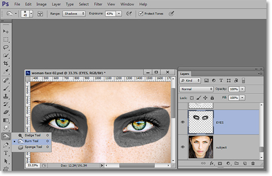
The idea with dark areas is to keep the highlights visible to create texture. If you are having trouble getting it just right, try the following technique. Stop adjusting a little before you think the eyes are dark enough. Then press Ctrl+J to duplicate the EYES layer and change the blending mode to Overlay. Adjust the intensity of the effect by adjusting the opacity of the top EYES layer. This technique also works in opposite for the white portion.
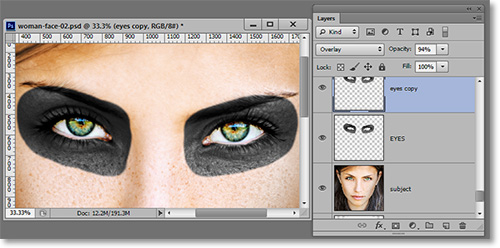
If your edges are too sharp, it will lose realism. Often times I will use the drawn layer (in this case, “eyes”) and place it under the EYES layer. Then I’ll give it a light Gaussian Blur to give the edges a softer, more realistic look. Alternately you can run the Blur Tool over the edge of the EYES layer for a similar effect.
Repeat the process with the nose and mouth. If the mouth doesn’t look right, see if the lines of the teeth follow the contours of the lips. This will help fool the eyes into believing the effect.
The Best Workflow
After I grasped the basic concept, I edited each painted element from beginning to end instead of grouping the stages as we’ve done here. The basic method is as follows:
- Paint your pattern over intended area of face with a solid-color.
- Create a selection of the painted area.
- Copy the selection in the subject layer.
- Paste the copied layer above the subject layer in identical position.
- Desaturate the pasted layer.
- Lighten or Darken pasted layer with Brightness slider.
- Fine-tune with Dodge or Burn Tools.
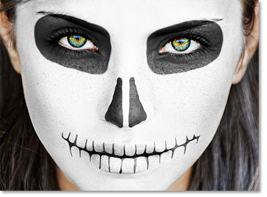
Once you get used to it, it goes pretty quick. Here is my final simple version.
Revealing the Eyes
At this point, you have the eyes still covered by two different layers. Use a mask on one of the layers to cut out the eyes and make them visible. To duplicate that mask up to the other layer covering the eyes, place your cursor over the mask in the Layers Window, press Alt and drag the mask to the desired layer. If you are not familiar with masks, you can read our article on that subject here. Using the eraser also works but fixing your edit later will not be possible.
Painting in Color
As mentioned earlier, applying color is a little trickier than applying black or white. The first difference comes during the desaturation point. With color, you don’t need to do that. Instead of desaturating, press Ctrl+U to call up the Hue/Saturation edit window. Select the Colorize Box and adjust Hue and Saturation.
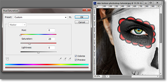
The same methods of Dodging and Burning still apply with color. Bright colors would follow the same rules as white in that you are trying to brighten while maintaining shadows. And vice-versa with dark colors.
Here is my final version. The shading in the cheeks was done with a Burn Tool directly on the white portion of the face, but there are many different non-destructive ways to attain the same effect.
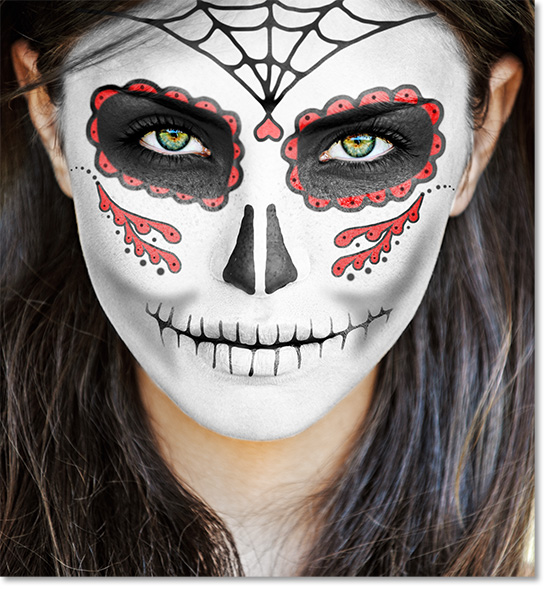
You can apply these methods to nearly any aspect of face painting. This method also works for regular makeup, clowns, tattoos and face-painting for kids.
Bonus Step
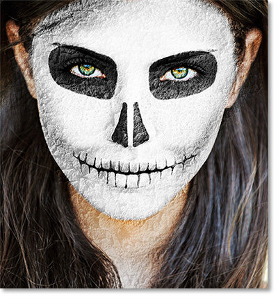
Since it’s Halloween, let’s make our dead lady decay a little. Use a texture of some sort and place if over the image. Go through the blending modes to see which one is best. I usually find Overlay or Soft Light work best, then increase the texture layer’s contrast. We used peeling paint for this example. Erase or mask out the area outside the edges (or don’t if it looks good). You can do this to any portrait for a quick spooky effect.
Happy Halloween!
Stay updated with all our new releases and articles by signing up for our free email updates. We only send emails once a week to keep you updated and we NEVER spam or share your information.
