Curves Adjustment in Photoshop Pt. 2
Expanding Dynamic Range
If you want to lighten a particular shade in your image without affecting another, this is a good tool for that use.
For our example image, I want to lighten the background a little, but I don’t want to lighten the highlights. In order to do that, I will need to create anchor points between the highlights that I want to protect and the shadows that I want to lighten.
I place my cursor over the light area of the image (1) and click to create an anchor point. Then along the curve, I create another one just a little darker (2). This will minimize any variations in that area, so now I can go over to that dark area (3) and bring it out without affecting the hightlights too much. If you didn’t catch that, reread the last paragraph, it’s a handy technique.

The three eyedroppers to the right are pretty helpful too. With them, you can create the black, white or 50% gray point in your image.
To continue on with our previous example, what if you wanted to make that lighter part in the background disappear and be completely black?
Click on the black eyedropper and click the part of the background you want to be the black point in the image. Keep in mind the rest of the image is going to darken to the same relative degree, so the entire image will get darker. The same principle applies to the gray and white eyedroppers.
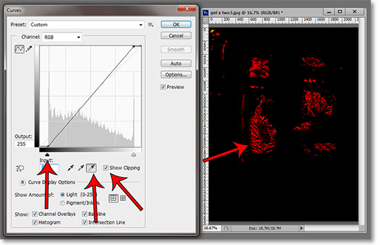
The “Show Clipping” box next to the eyedroppers is a good feature to see what pixels are being clipped. These are the pixels that are either pure black (0) or pure white (255). Click on the black eyedropper and check the box to see where the shadows are clipped and clip on the white to see the its clipped pixels.
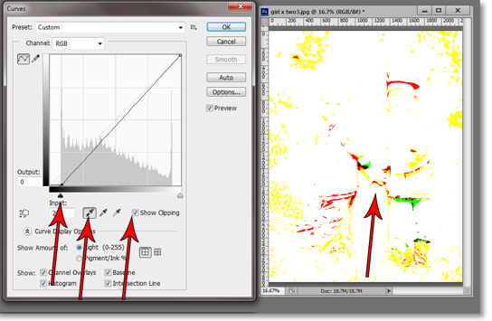
Within both black and white clipping views, you will also be able to see what colors are clipped as well. They indicated by their color. In other words, if the reds are clipped, the warning will appear in red and so on.
There is a button to extend the dialog window. The things below are of minimal use except for specialized purposes. The exception being the grid-count adjustments.
Below the Clipping box are two buttons. This gives you the option to turning the default ten-by-ten grid into a four-by-four grid. I prefer the four-by-four because then each box represents a point on the tonal spectrum. At the bottom-left is black, then next box up and right is the shadows, next is 50% gray, then highlights and finally whites. In my experience, it’s a rare edit that requires more edit points than that.
To the left of those buttons are the choices between the default 0-255 tonal shades and a 0-100 scale of pigment-to-ink percentage. It doesn’t change anything within the image. It’s simply a way of indexing tone in printing terms.
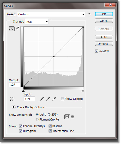
The four boxes at the bottom reveal or hide various items such as histogram and baseline. I’ve never had an occasion to use these. I just leave them all checked and forget them.
Adjusting Colors in Curves
Did you just heavy sigh? Don’t worry; the same principles apply to color as they do to tone. The histogram for each color corresponds with the amount of pixels in each shade. As with tone, you can find and adjust each area of color.
Within each color’s channel, you can adjust it much in the same way you would with color balance. In RGB color mode in the red channel, pulling the curve up increases the red and decreases the cyan. This is true of each respective color channel. Basically, in any color mode, pulling up will increase the color of that channel and pulling down will increase that color’s opposite.
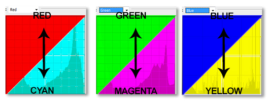
The color opposites in RGB mode are the following; red-cyan, green-magenta and blue-yellow.
Real-World Usage
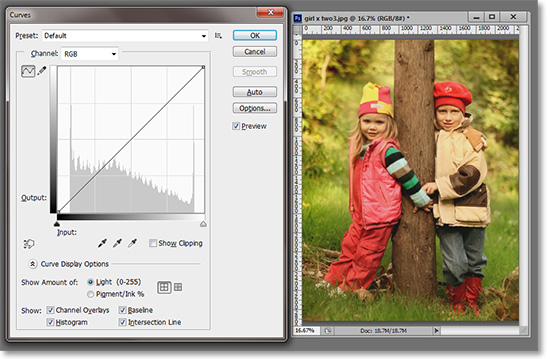
For our example, we will be using this image of these two adorable girls; Olivia and Sophia. These two can’t take a bad picture. However, this image could use some tweaking to do these girls justice.
I work in the order of exposure, contrast and color. If you adjust color first, it will change if you have to adjust the other two and you will have to go back adjust more.
This image is exposed properly, so no real adjustment in exposure is needed. Often if you adjust the contrast properly, the exposure will fall into line. This image definitely needs some contrast adjustments.
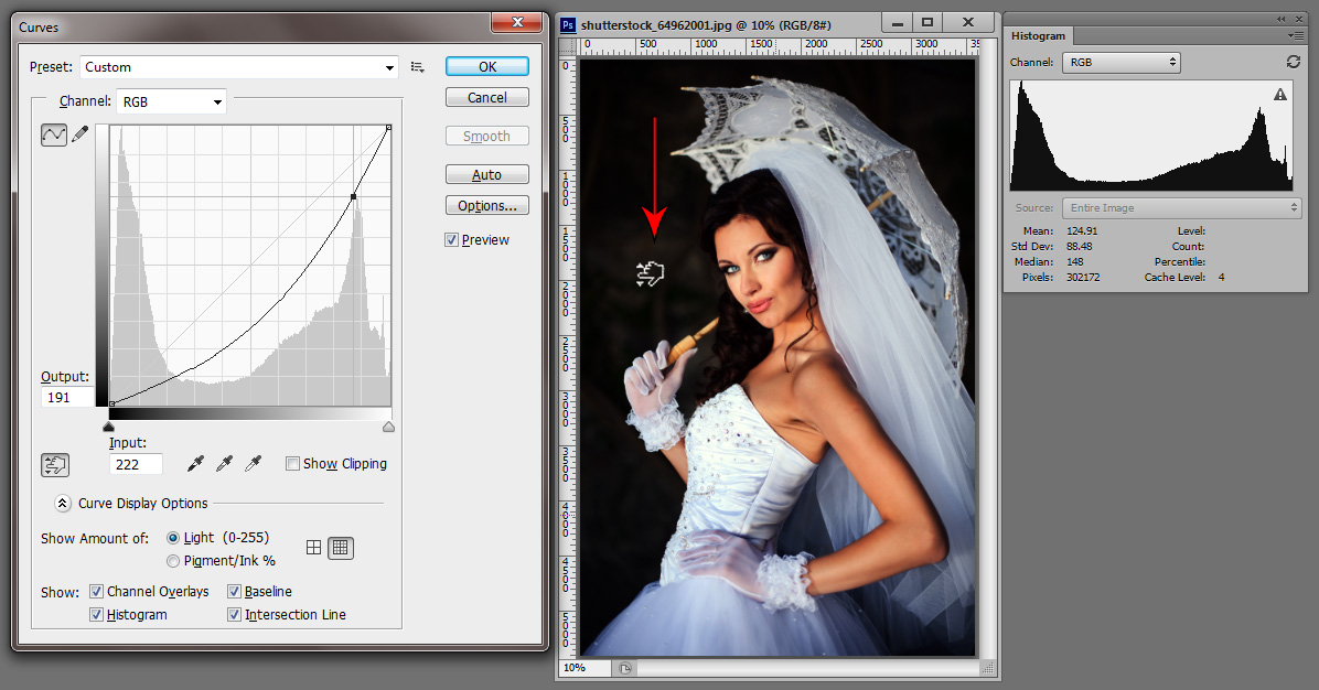
I pressed Ctrl+M to call up the Curves adjustment. You may want to bring up the separate histogram window as well by going to Window>Histogram..
I’m going to start by adjusting the blacks. I clicked on the black eyedropper and checked the Show Clipping box. I dragged the black slider to the right and stopped when I saw the clipping warnings (22 in the Input field).
Notice the yellow, red and green clipping with a touch of black mixed in there. I backed the slider off to just before the clipping occurred (20 in the Input field).
Next, I clicked on the white eyedropper with the Show Clipping box still selected. I pulled the slider to the left until I saw the warning and backed it off a little. I used the sliders, but for a more exact adjustment, you can enter the output or input numbers directly into their field.
As a general rule, you want to butt-up against each side of the blacks and whites just before clipping occurs. However, there are so many exceptions to that rule, one could write a book on it. For example, a foggy day may have no true black within the image or a high-key portrait may technically have completely blown-out whites.
This image does fall into the bounds of the good contrast rule. Below you can see the before and after with their respective histograms.
This image needs some color adjustments. What I see is too much yellow. So much so, my white balance was probably off when this was shot. It looks like there may be some issues with red as well, but one item at a time.
Yellow is the opposite of blue, so I selected the blue channel from the drop-down menu above. The yellow cast seems to be uniform throughout the image, so I created an edit point in the middle of the curve and pulled up to add more blue (or take away yellow).
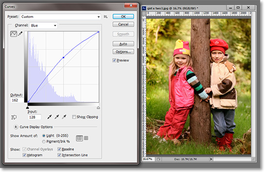
I could have done the same thing with that set and drag button and placing my cursor over the image at the point I wished to change, click and hold and drag up. I left a little yellow cast because it was late afternoon and the tones were warm.
I thought there might be some issues with the reds and greens so I went to the green channel and pulled it up. I like what it did to the foliage in the background, but it created a sickly green cast on the girls.
The image below is the same adjustment to the greens using an adjustment layer and masking the girls.
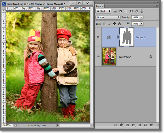
This is a good example of why one should use the curves adjustment layer rather than the curves adjustment from the menu. Check out our articles on adjustment layers.
Stay updated with all our new releases and articles by signing up for our free email updates. We only send emails once a week to keep you updated and we NEVER spam or share your information. We’ve got that catchlight brush series and tutorials coming up as well.
Stay updated with all our new releases and articles by signing up for our free email updates. We only send emails once a week to keep you updated and we NEVER spam or share your information.
If you enjoyed this article, get email free updates
Article Takeaways
1. Never let the curve go horizontal flat..
2. Never let the curve go down.
3. Make small adjustments at the risk of posterization.
4. Use curves in 16-bit to minimize posterization.