Tone Adjustment Layers in Photoshop
We covered the Fill Adjustment Layers in our previous article in the series on Adjustment Layers in Photoshop. Now we will explore the next set in the sequence; Tone Adjustment Layers. We will explain the basic layout of each adjustment and give you an idea of which option is best for your needs.
Just like when other adjustment layers are created, each layer’s properties dialog box will appear immediately. Unlike the Fill Adjustment layers, the Tone Adjustment Layer’s dialog boxes will include a button for the adjustment layer’s mask properties dialog box as well. For a detailed explanation of the adjustments avaialable in the Mask Properties box, take a look at our article on the subject.
Brightness/Contrast Adjustment Layer
Of the four tonal adjustment layers available, the Brightness/Contrast is probably the simplest and most intuitive of the adjustments. But in Photoshop, as in life, the simplest and most intuitive is rarely the most comprehensive.
Before explaining this adjustment, I would like to say that I never use this function at all anymore. The Levels and Curves adjustment layers are far superior to Brightness/Contrast (B/C) adjustments.
As I also did once upon a time, many beginners use this adjustment primarily because it’s easy to understand. Who knows what “curves” means until you learn the tool? No one. But everyone understands what “brightness” means.
As if it wasn’t easy enough to figure out, the first thing you see when activating the B/C adjustment layer is a button that says “Auto” (1). As you would think, this is Photoshop’s equivalent of the easy button. Click it and you’ve given Photoshop permission to determine the best settings. The program is pretty good at figuring out those settings. If you’re not sure how to proceed, give the button a click just to see if Photoshop gets it right. You can always readjust, if not.
The first slider is the Brightness adjustment (2). Move the slider to the left and the image pixels will get darker at the same rate. Move the slider to the right and the image will get brighter.
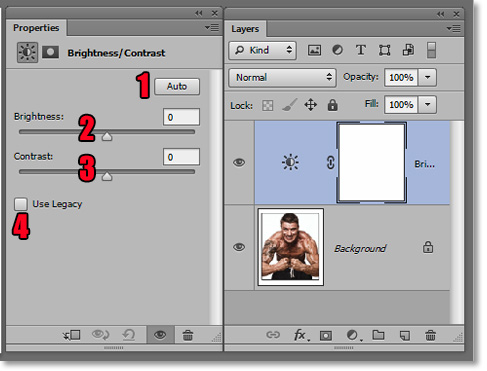
The second slider is the Contrast adjustment (3). Dragging the slider to the left reduces the contrast and moving it to the right increases the contrast.
The “Use legacy” box (4) is essentially useless for photographers in this context. It can be useful when editing masks. What the “use legacy” box means is that the highlights and shadows will be “clipped” or lost.
Levels Adjustment Layer
The Levels adjustment layer is good transition from its Brightness/Contrast and Exposure counterparts. It is second only to Curves as far as depth of functionality.
When created, the first option available in the Properties window of the Levels layer is the Presets drop-down menu (1). If you are not familiar with Levels, I suggest playing with the presets to see what each label such as Darker, Increase Contrast, Lighten Midtones and more. You can see how each preset moves the sliders along the histogram. If you are unfamiliar with Histograms, take a quick look at our article on histogram basics.
Below the presets, you will see the RGB drop-down menu (2). Clicking on this will produce the three options for adjusting the red, green or blue channels individually. Most of the time, you will be working in the default RGB color mode.
Manipulating color channels is useful and a subject for a near-future article. However, if you’re advanced enough to know how to edit color channels, then you’re probably using Curves instead of Levels.
To the right of the RGB drop-down menu is the “Auto” button (3) which will turn over the contrast decisions to Photoshop’s algorithm.
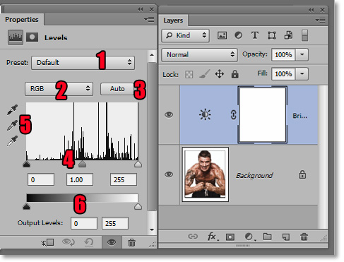
Below that is the histogram with the three sliders (4); black, 50% gray and white which adjust their respective shades. To the left of the histogram are three eyedroppers that set the three shading points (5).
Set the black eyedropper and place it over the point in your image that you want to represent black and click to set that point to black and the rest of the image will adjust accordingly. The same can be done with the 50% gray and white eyedroppers as well.
At the bottom of the Levels Properties window is the Output Levels sliders (6). Move the black slider right to clip the shadows or drag the white slider to the left make the white point darker. If the two sliders are perfectly overlapping, then your image will be solid at the shade point at which the sliders overlap.
Curves Adjustment Layers
I’ve been building up to Curves, but it’s well deserved. Curves adjustment provide for the most brightness and/or contrast options. It may seem daunting at first, but the time taken to learn the basics of Curves will pay off many times over by improved workflow and better images overall.
This section is designed to convey what functions are available within the Curves Adjustment Layer. For a full description of understanding and editing curves, you are going to have to tune in tomorrow for our Curves article. Yes, that’s right! Tomorrow, you will get two articles for the price of one. Not bad for free, eh?
As with the Levels adjustment layer, you have the option of selecting from a list of presets (1). Unlike with Levels, what you can learn from playing with the presets is limited, but it will give you an idea of how complex and deep in function that curves can be to a photographer or designer.
Also as in Levels, you have the option of choosing from one of the RGB colors (2) or from the components of whatever color profile you are using. The “auto” button (3) is to the left of this list.
Of course, the histogram is available. Below the histogram are the Input and Output levels (4). Placing your cursor over any point in the histogram will result in the numeric display of the respective Input and Output levels of the point at which your cursor is on.
To the left of the histogram are the editing buttons. The first of these buttons is a hand with a pointing index finger (5). There are two small black arrows above and below the hand. This is the manual curves modification button that allows indexing and manipulation directly from the image.
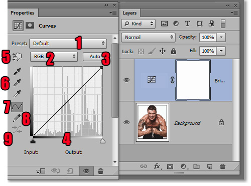
The next three buttons down (6) sample and set the black, 50% gray and white points as is available in Levels.
The next button (7) allows you to edit the curve directly from the histogram by grabbing and dragging edit points.
The button below that (8) allows you to draw your own curve directly onto the histogram.
The button below that (9) smooths the histogram that you have drawn. It is only active when the curves drawing button is selected.
To experiment, click on the Draw on Histogram button at any point within the active histogram. You will see points in your image that represent that point on the histogram. Draw whatever you want. Just a scribble is fine. Now click on the smoothing tool and watch what it does. Click several times and watch the curve become smoother until it finally becomes a straight line.
Note that Curves are not available in Photoshop Elements. The only two adjustment layers from the Brightness category are Levels and Brightness/Contrast.
Exposure Adjustment Layer
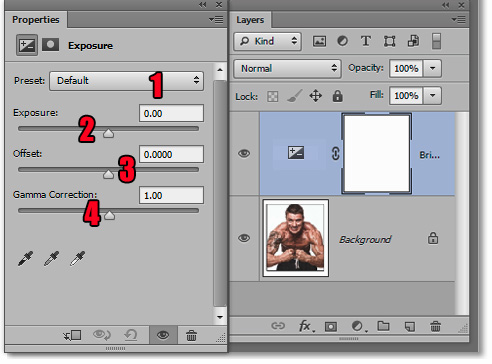
When creating a new layer for the Exposure adjustment, you are met the usual Presets drop-down menu (1). The options are less than impressive with a couple of bumps up or down the exposure setting.
The Exposure slider (2) is weighted to affect the highlights more than the shadows. The Offset (3) affects shadows more than highlights. And the Gamma (4) affects the midtones like the middle slider in Levels.
I hadn’t really used the Exposure adjustment layer much before this. With names like Gamma and Offset in the adjustments, I really expected some high-end color spectrum manipulation doo-hickeys. But after hours of familiarization, I find them just unintuitive adjustments that can be done in either Levels or Curves much easier and more effectively.
Those are the four tonal adjustment layers available on the pro versions of Photoshop. Elements versions only include Brightness/Contrast and Levels. It’s better to have curves available, but the rule of diminishing returns applies. As long as you have the Levels adjustment, you will have enough control.
Stay updated with all our new releases and articles by signing up for our free email updates. We only send emails once a week to keep you updated and we NEVER spam or share your information. We’ve got that catchlight brush series and tutorials coming up as well.
If you enjoyed this article, get email free updates
Article Takeaways
1. The second set of adjustment layers are the Tone Adjustments.
2. Brightness/Contrast is intuitive, but not very deep in function.
3. Levels are good for most adjustments.
4. The Curves are the most comprehensive of all the tone and contrast adjustments.
5. Exposure is of limited usage.