Curves Adjustments in Photoshop

The Curves adjustment is one of the most powerful editing tools available in Photoshop. From the Curves adjustment, you have complete control over all aspects of the color, tone and contrast of your image.
If you are just getting started in Photoshop, do yourself a favor and take a few minutes to read our article on histograms. Knowing how to read a histogram is essential to being able to edit using curves.
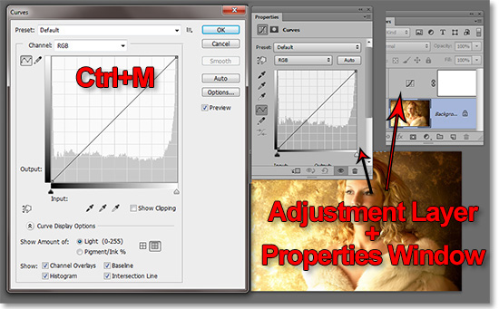
You can edit curves in either of two methods. In its adjustment layer form and you have nearly total control over blend modes, masks and layer effects. Below are the standard Curves adjustment window and the Curves adjustment layer Properties window.
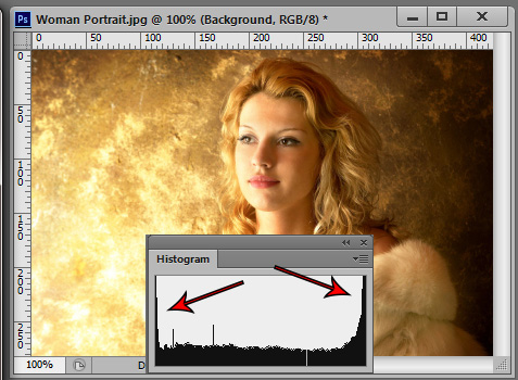
In our example image, you can see the how the histogram peaks at each end which indicates are large amount of pixels in the blacks and the whites.
Curves are basically a more advanced version of Levels. In fact, the only real difference is that Levels edits using three sliders; black, white and midpoint. Curves adjust using up to sixteen edit points.
To bring up the Curves Dialog Window, go to Image>Adjusments>Curves or press Ctrl+M. However, I highly recommend using the Curves Adjustment Layer instead because it is non-destructive..
However, for the purposes of this article, we will be using the image adjustment window instead of its adjustment layer counterpart since the window has a larger viewing area. Whatever applies to one will apply to the other.
We will start with the black slider. Moved up halfway the left vertical side, you can see the Output level is at 128. Notice the histogram is devoid of any pixels between black and 50% gray. We have effectively clipped the shadows all the way to 50% gray.
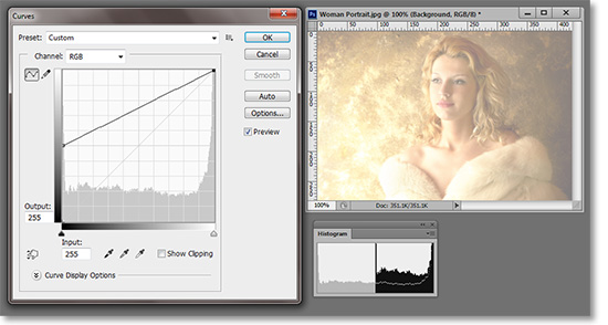
Also notice the jagged little white line running horizontally through the histogram. Everything below that line is the original histogram before the adjustment took place. The “ghost” of the pre-adjustment histogram also extends into the empty area.
In the next image, the white slider has been moved down the right vertical side to the 128. The histogram now shows that all pixels within the image are at 50% gray.
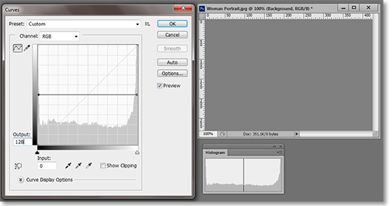
To save some space here, we’ll dispense with the visual aid for the next two points. But, if that horizontal line was at the top of the curves histogram window, the image would be pure white. If the line were at the bottom, the image would be black.
Essentially a horizontal line in Curves can be thought of as a brightness slider than can be altered at each end and points in between. This is just to help conceptualize the curves line. In a real-world situation, you rarely want the curves line to go horizontal or downhill. The result will be a gray cast or inverted color.
Next we moved the black slider horizontally to the middle. The input reads 128 which is predictably the opposite of what we did in the last example. Instead of pushing the pixels to the middle, we are pulling them to the shadows.
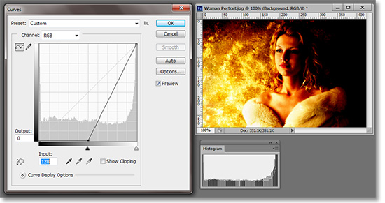
Again, you can see the ghost of the old histogram behind the current adjustment. Although, this time it is a little harder to distinguish. You can see the vertical gaps in the histogram mean that there are gaps in the tone gradient. In other words, there is posterization within the image.
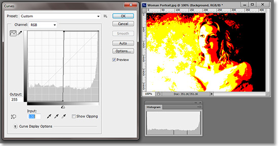
If we take the white slider and move it left along the top, we see that the pixels are being pushed to the extreme highlights. So, a vertical line does the opposite of the horizontal line. It brings everything to its highest possible contrast.
If the anchor points are at their default position of black at bottom-left and white at top-right, then clicking on the middle of the line and pulling it diagonally up and left is the equivalent of dragging the midtones slider in Levels to the left toward the shadows. Conversely, pushing the curve in the opposite direction is akin to dragging the midtones slider to the right.
Getting Around the Editing Window
We’ve established the basics the sliders as they relate to tone. Everything we’ve done so far could be done in Levels.
At the top of the Curves Adjustment Dialog Box is the presets drop-down menu. It contains a few useful items like increased contrast and the like.
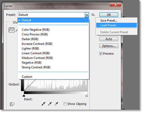
To the right of the drop-down menu you can save or loads presets. This can be useful if you find a particular curve works well for a session, you can save it and apply it to the rest of your images individually or automatically via the actions feature.
This is probably a good time to repeat the Reset feature included in most dialog boxes. The “Cancel” button at the top right of the window below the “OK” button can be changed to a “Reset” button by pressing the Alt key. This is handy to know when scrolling through different presets or when your curves edit has gotten out of control. This and other Photoshop Kwik&EZ Tips can be found here.
Below the presets is the Channel Selector. This will show the options available for your particular profile. As usual, we will be working in Red, Green and Blue. You can edit each individual channel as well. We will get into that a little later, but for now we will be working with them all combined in RGB.
Going down the left side of the window are two buttons. The first button enables editing of the curves by creating edit point (up to 16 including the two anchor points) and dragging in the desired direction of the edit. This is a great feature when one is familiar with reading and editing curves.
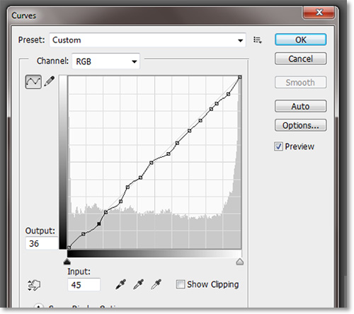
Create edit point by clicking on or near the curves line. The cursor will turn into a crosshairs when you are at an editable point. The active edit point will be black. To remove an edit point, press the Ctrl button while clicking on the edit point.
Next to that is the button that enables you to draw your own curves. This is also a tool for the advanced user. It works by drawing along the curve line. Once drawn, you can smooth the line by clicking the button on the other side of the histogram window under Cancel. It’s the Smooth button. Smoothing the line will create better gradients and help minimize posterization. It is only active when drawing edit points.
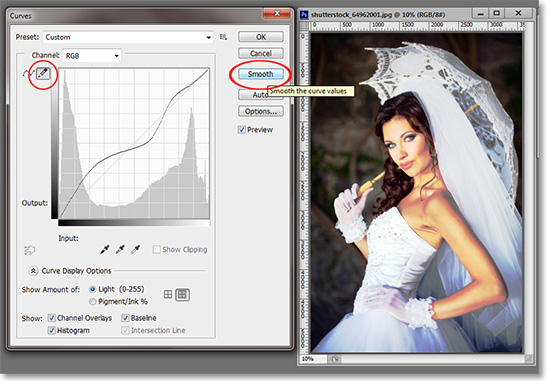
A feature added to more recent versions of Photoshop is the ability to edit the curves within the image itself rather than just from the editing window. About a third of the way down the curves window is a button with a hand and two small arrows above and below it. This button is only active when the left of the two buttons above it are active.
Click on this button and go anywhere on your image. The pixel that your cursor is over will be shown along the curve line.
In our example, notice how the circle shows up to the left of the histogram when placed over the background. If I click over that point, an edit point is created in the histogram. If I click and hold, then drag the cursor up, the curves will adjust from that edit point to lighten the image. If I drag down, then it darkens the image.
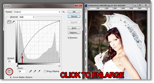
If I placed my cursor over a light area on her dress, it would do the same thing from that particular edit point.
Practice with your own image by placing your cursor over various areas and seeing where they fall on the spectrum.
In part two of this article, we will show look at how to adjust colors in Curves and also some practical usage tips for everyday usage.
Mastering Curves in Photoshop (CONTINUED)
Stay updated with all our new releases and articles by signing up for our free email updates. We only send emails once a week to keep you updated and we NEVER spam or share your information. We’ve got that catchlight brush series and tutorials coming up as well.
If you enjoyed this article, get email free updates
Article Takeaways
1. Never let the curve go horizontal flat..
2. Never let the curve go down.
3. Make small adjustments at the risk of posterization.
4. Use curves in 16-bit to minimize posterization.


