Color Balance Adjustment Layer
We are continuing our coverage of each of the adjustment layers available in Photoshop. If you haven’t seen them all, we have included them in the right-hand column on this page
So far, we have been through the first two sets of adjustments; the fill and the tone adjustments. We did an even more detailed analysis of the Curves adjustment within the tone adjustment set because understanding curves is critical to editing images effectively.
Color Balance is the third of seven selections in the Color Adjustment Layer Series. It is arguably the most important to understand within the series because it is the basis for being able to view an image and know that the color is properly balanced. Or, if it isn’t balanced, what needs to be done to fix it.
RGB Color Profile
This is a good point to mention that this article is only going to cover the RGB (Red, Green and Blue) color profile that is common to nearly all digital photography. It’s the color profile of our computer monitors, televisions and every other light projected screen we use.
If you do a lot of professional print work, then you may be familiar with CMYK color profiles as well.
A detailed explanation of color profiles could fill a large book, so suffice it to say that for the purposes of this article, the basic adjustment concepts apply to the vast majority of color profiles used.
Within red, green and blue there are six possible basic color casts. You have likely seen these casts and may have never realized it. Old photos often cast yellow or magenta cast which is now recreated intentionally within portraits to give a retro effect. We have couple of articles regarding tinting and retro effects in Photoshop.
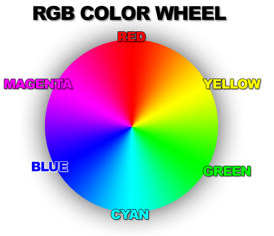
Each color or its opposite can dominate and create an overall color of an image. The opposite of red is cyan which is essentially a blue-influenced green. The opposite of green is magenta which is a yellow-influenced red. And the opposite of blue is yellow.
The following image shows the physical location of each of the six colors on the RGB color wheel. See how they are of equal distance from each other and how the opposite of each color is 180-degrees apart.
Editing Color Balance
If you have read any of our other articles, you know that we are advocates of non-destructive editing. So, it shouldn't come as any surprise that we highly recommend using the color balance adjustment layer from within the Layers Window instead of the color balance adjustment in the menu acessible by going to Image>Adjustments>Color Balance (Ctrl+B).
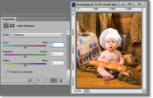
The interface for color balance is mercifully simple. There are three sliders for each color. As usual, I recommend playing around with the sliders to get a visual familiarity with a color imbalance.
The following series of images are intended to illustrate the difference in color cast from each adjustment. We will start with the image in its fully balanced form.
This image shows the difference between cyan and red.
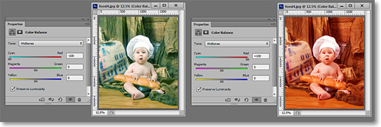
This image shows the difference between magenta and green.

And finally, this image shows the difference between yellow and blue.

Above the sliders is a drop-down menu from which you can choose the hightlights, midtones or shadows. The image below shows the difference between the three adjustments using the same color and adjustment level.
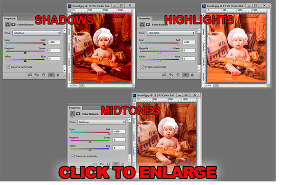
You will likely want to keep the "Preserve Luminosity" checked to ensure no shift in tone occurs while adjusting color. The mask properties window is available as well.
Those are the essentials of color balance in RGB mode. If this is your first exposure to color balance, go back and take a look at some of your final output images. With your new eyes, you may see something that you didn't before.
Stay updated with all our new releases and articles by signing up for our free email updates. We only send emails once a week to keep you updated and we NEVER spam or share your information.
If you enjoyed this article, get email free updates
Article Takeaways
1. This tutorial uses the most commonly used color profile of RGB.
2. The opposite of red is cyan.
3. The opposite of green is magenta.
4. The opposite of blue is yellow.


